I’m always annoyed with myself when I don’t publish my code, so this is a follow-up to my Logging the temperature and humidity post.
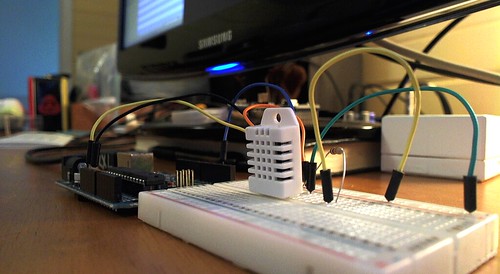
This whole thing is definitely a work in progress. The hardware has exposed wires, and the software is all just cobbled together pieces. Making something that works is much different than making something that will continue to work, and work properly, and efficiently. Making something that works is a first step. It’s an important step, but it’s only the first step. So let’s begin!
I started with the example from Adafruit over on GitHub and about the only changes I made was to the format output of the data.
// Example testing sketch for various DHT humidity/temperature sensors
// Written by ladyada, public domain

#include "DHT.h"
#define DHTPIN 2     // what pin we're connected to
#define DHTTYPE DHT22   // DHT 22  (AM2302)

DHT dht(DHTPIN, DHTTYPE);

void setup() {
  Serial.begin(9600);
  dht.begin();
  delay(1000);
}

void loop() {
  int h = dht.readHumidity();
  int t = dht.readTemperature();

  // check if returns are valid, if they are NaN (not a number) then something went wrong!
  if (isnan(t) || isnan(h)) {
    Serial.println("Failed to read from DHT");
  } else {
    Serial.print(h);
    Serial.print("\t");
    int temperatureF = (t * 9 / 5) + 32.5;
    Serial.print(temperatureF);
    Serial.print("\n");
  }
}
So this outputs the value for the humidity, then a tab, then the value for the temperature, and then a line return. Oh, I did change the code to output the temperature in Fahrenheit instead of Celcius. If we get a bad value, it’ll print “Failed to read from DHT” though I’ve yet to see that in the log files, I should probably take it out. Also, the Arduino just streams data at a fast rate, much faster than I need. I typically put the sleep functions (to limit the amount of data logged) in my reading code which runs on the computer. I think this is the right way to go, but if you have other ideas, please let me know.
Here’s a fairly simple Processing sketch that will read the data coming in from the Arduino. (Obviously you need the Arduino connected to the computer via USB.)
import processing.serial.*;

PrintWriter output;

Serial myPort;    // The serial port:
PFont myFont;     // The display font:
String inString;  // Input string from serial port:
int lf = 10;      // ASCII linefeed

void setup () {
  // set the window size:
  size(500,200);
  println(Serial.list());
  myPort = new Serial(this, Serial.list()[0], 9600);
  // don't generate a serialEvent() unless you get a newline character:
  myPort.bufferUntil('\n');
  background(50);
  output = createWriter("output.txt");
}

void draw () {
  // everything happens in the serialEvent()
}

void serialEvent (Serial myPort) {
  // get the ASCII string:
  String inString = myPort.readStringUntil('\n');

    String[] words = split(inString, '\t');
    String humid = words[0];
    String tempe = words[1];

    background(50);
    textSize(40);
    text("   Humidity: " + humid, 40,90);
    text("Temperature: " + tempe, 40,160);

   output.printf("%d-%02d-%02d %02d:%02d:%02d\t%s", year(), month(), day(), hour(), minute(), second(), inString); // Write to the file
   output.flush(); // flush output
}
Besides displaying a small window with the humidity and temperature (seen at the top of this post) it will also log the data to a file named output.txt
Processing Output
2011-07-25 19:09:14     44      91
2011-07-25 19:09:14     44      91
2011-07-25 19:09:15     44      91
2011-07-25 19:09:15     44      91
2011-07-25 19:09:16     44      91
2011-07-25 19:09:17     44      91
2011-07-25 19:09:17     44      91
2011-07-25 19:09:18     44      91
2011-07-25 19:09:18     44      91
This is pretty terrible, as we’re getting way too much data. I should probably add some delay into the Processing sketch, as it’s creating a log file line much faster than the sensor can even output data! This will result in large log files and is just wasteful. If all I wanted was the window showing the current temperature and humidity, I’d probably just delete the logging part of the sketch. Add that to the TODO list. Anyway, it works, and as a proof of concept, it’s a start.
Here’s the Perl code I was using:
#!/usr/bin/perl

use Device::SerialPort;
use IO::Handle; FILE->autoflush(1);
my $port = Device::SerialPort->new("/dev/tty.usbmodemfd411");

$port->baudrate(9600);
$port->databits(8);
$port->parity("none");
$port->stopbits(1);

my $fileout = './templight.log';
my $filerec = './templight-recent.log';

open (FILE, ">>$fileout") or die ("Ooops! Could not open $fileout: $!");

while () {
    # Poll to see if any data is coming in
    my $char = $port->lookfor();

    # If we get data, then print it
    if ($char) {
	$time = localtime(time);
	if (length($char) > 1) {

		my $str = ($time . "\t" . $char . "\n");
		print FILE $str;

		open (FREC, ">$filerec") or die ("Ooops! Could not open $filerec: $!");
		print FREC $str;
		close (FREC);
	}
    }
    # Uncomment the following lines, for slower reading,
    # but lower CPU usage, and to avoid
    # buffer overflow due to sleep function.

    $port->lookclear;
    sleep (10);
}
close (FILE);
The logging here is a little better than the Processing sketch, at least we add some delay with that sleep at the bottom so our log files won’t be quite as large. We’re saving to two files, templight.log and templight-recent.log. The second one just saves the current data, this just enables us to grab the data from that file and do something else with it, like… send it to Twitter or something.
Perl Output
Tue Jul 26 04:30:39 2011        46      89
Tue Jul 26 04:30:49 2011        46      89
Tue Jul 26 04:30:59 2011        46      89
Tue Jul 26 04:31:09 2011        46      89
Tue Jul 26 04:31:19 2011        46      89
Tue Jul 26 04:31:29 2011        46      89
Tue Jul 26 04:31:39 2011        46      89
Tue Jul 26 04:31:49 2011        46      89
Tue Jul 26 04:31:59 2011        46      89
So our output from Perl looks similar, though we have much less data (but still plenty of data) and the date format is a little different. (Chalk that up to laziness.) Oh, the Perl code also has the serial port hardcoded to /dev/tty.usbmodemfd411, which is lame, and I do have code somewhere to grab the serial port dynamically, but I didn’t implement it yet.
Whew! It feels so liberating to publish all that terrible code… (I mean my own code, not Adafruit’s!) Now I feel the need to start re-writing it and making it less terrible.