My daughter asked if I could make a printing plate and sent me this photo of a rock. (She’s a rock climber.) I’ve made lots of plates using 3D printing so I figured I would try to halftone the photo.
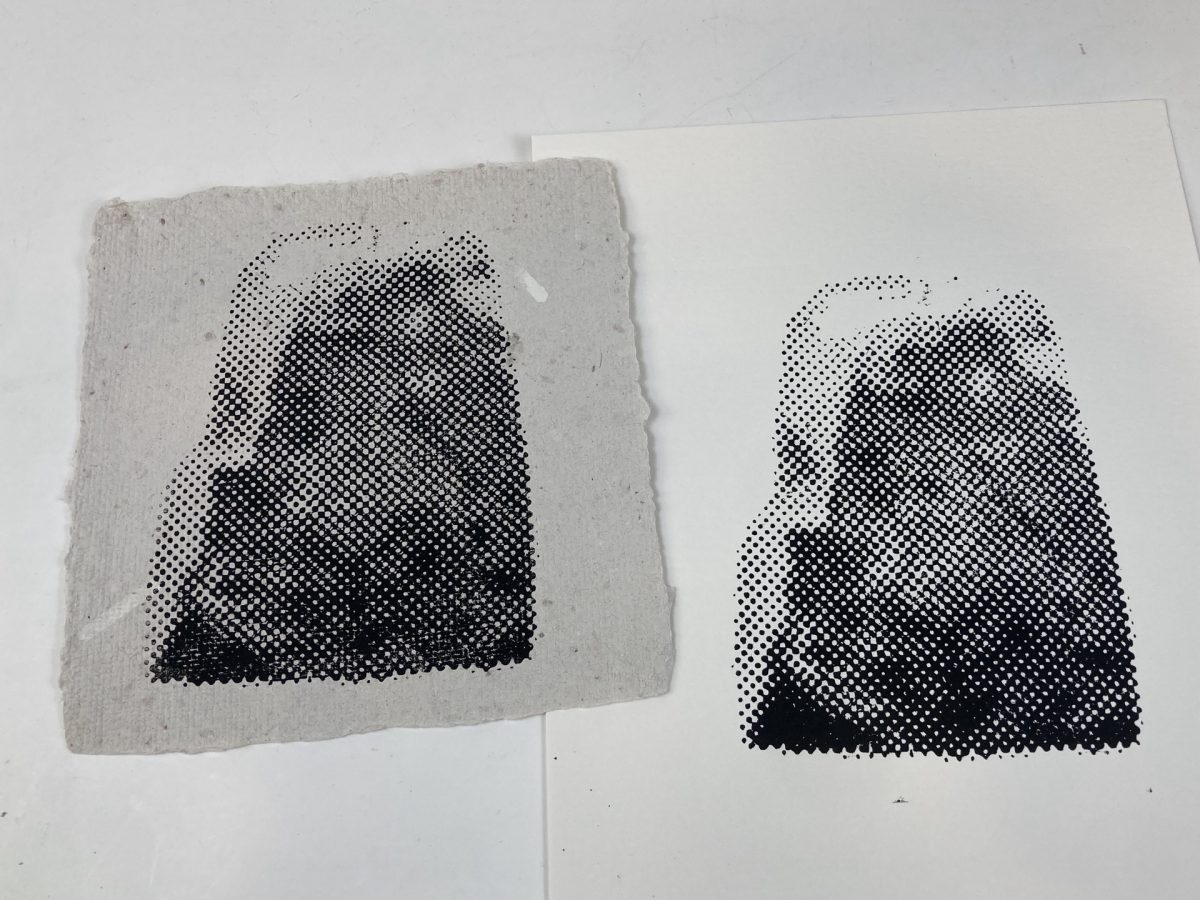
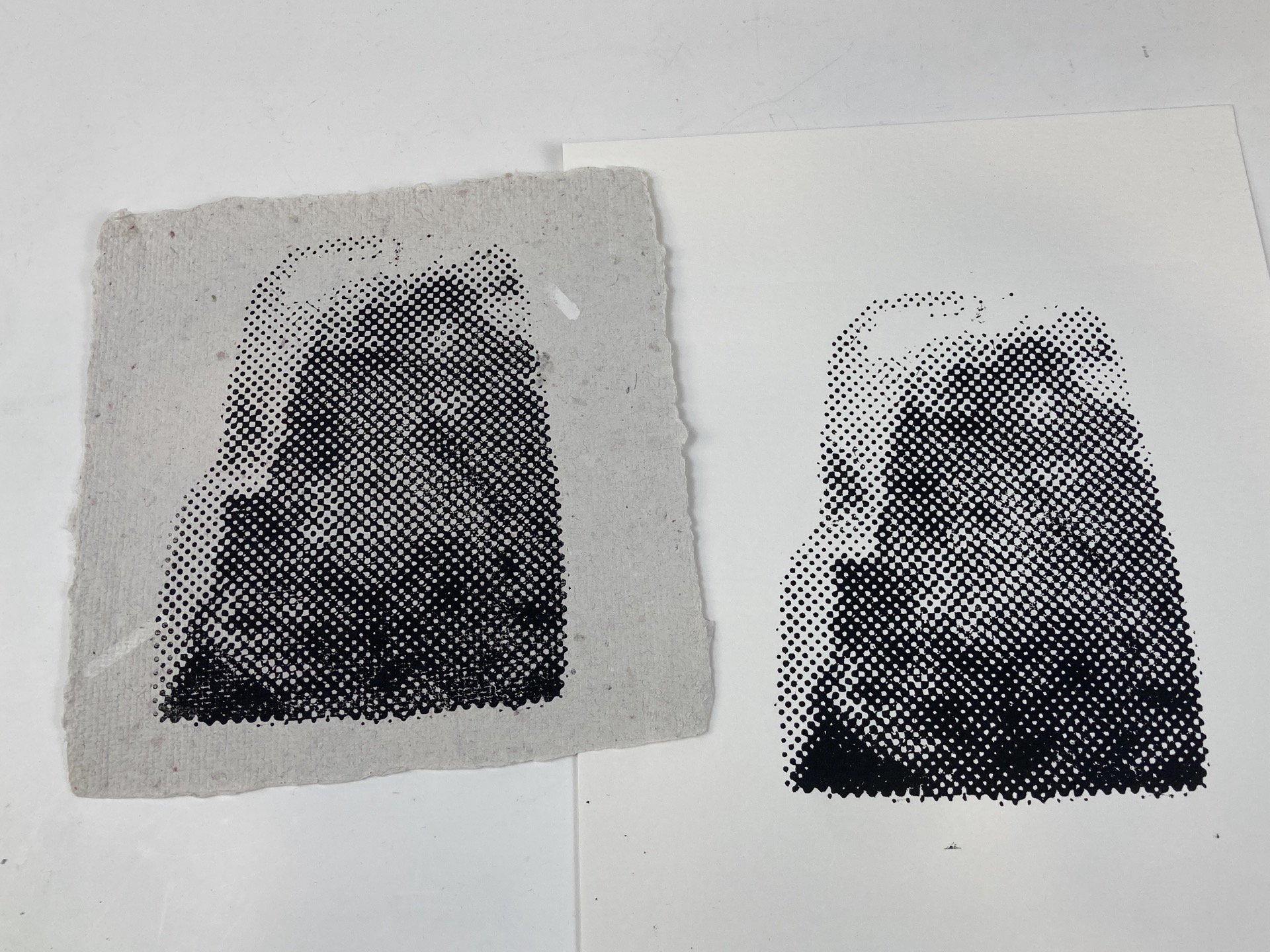
Above you can see two prints I made on paper using black relief printing ink.
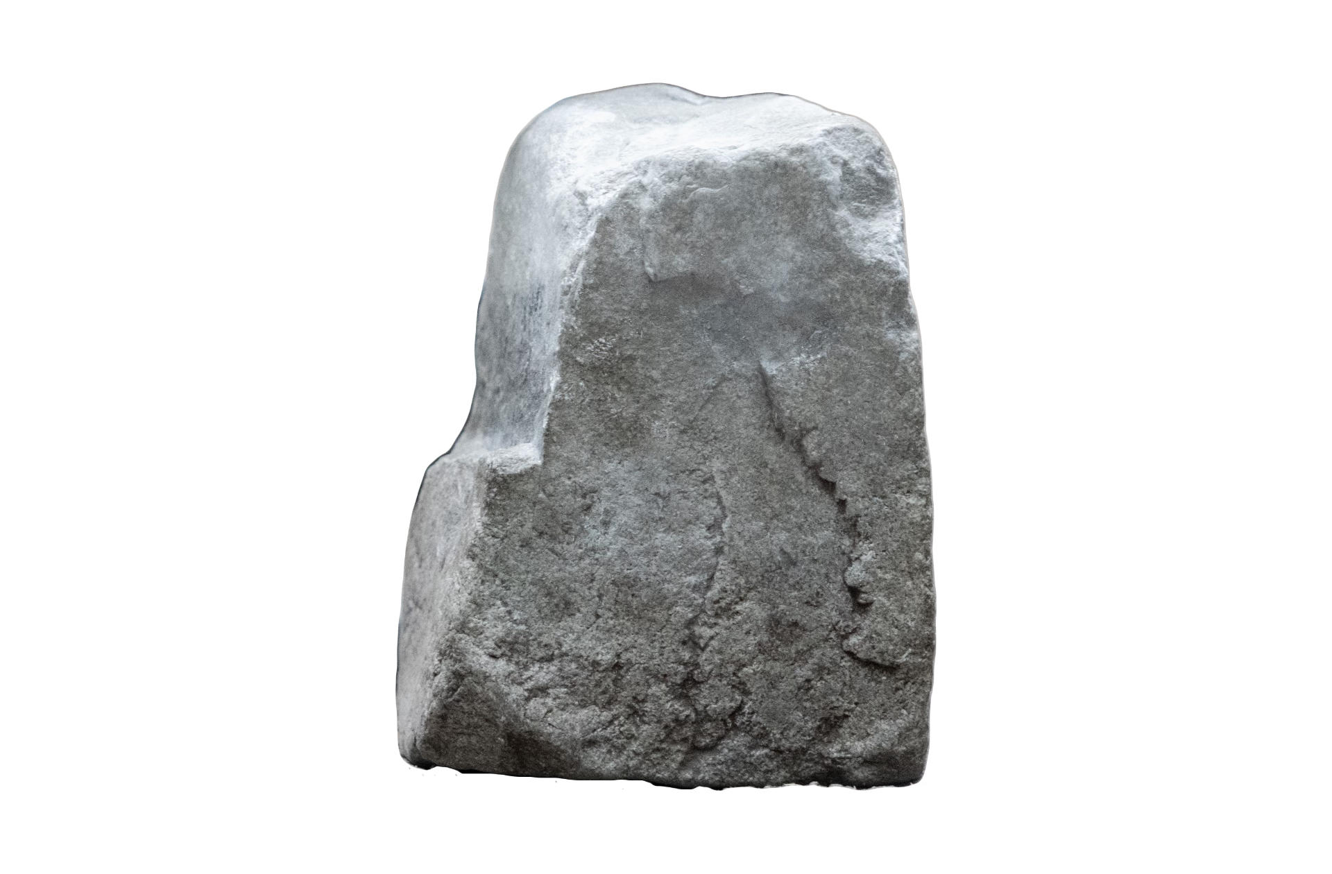
Here’s the original photo, in grayscale. Rocks have texture and some gradient and tone… Fun!
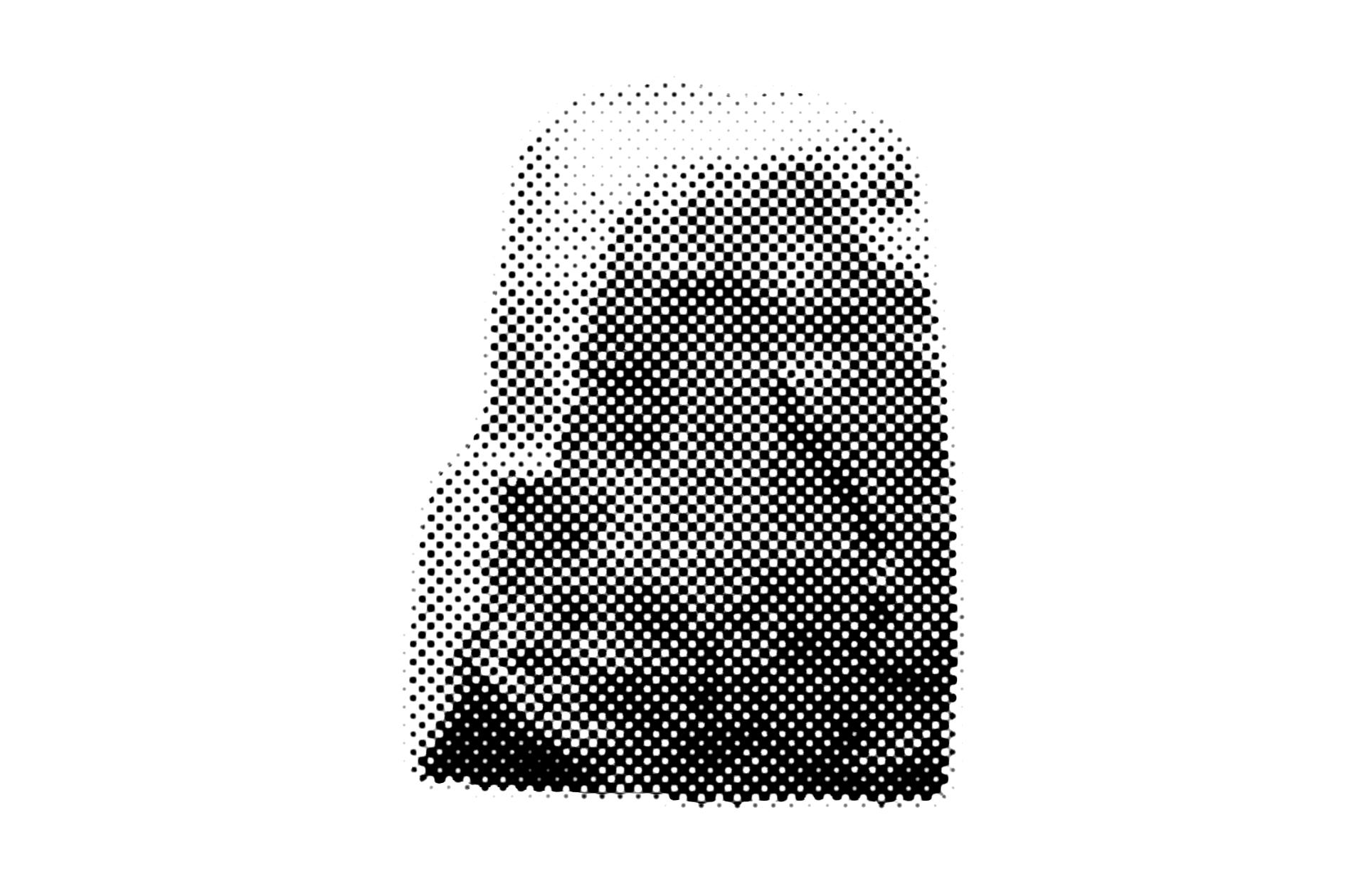
Here is the image after halftoning it. My first attempt used dots that were way too small. The file was 720MB and took a long time to load, and I got a warning in my slicer. Getting the halftoning right is tricky, and it’ll take some experimentation in the future.
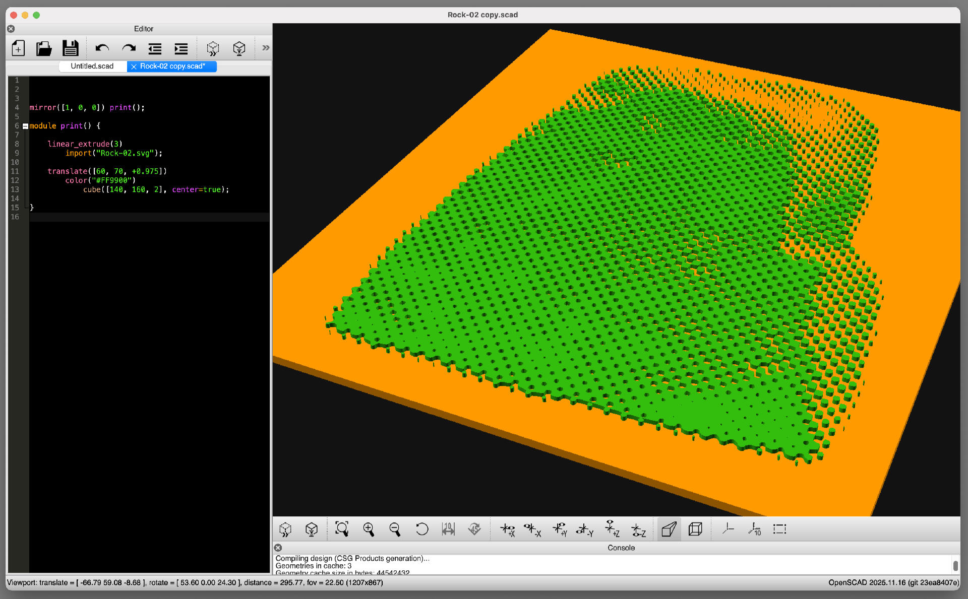
I converted the raster image into an SVG using Inkscape and then loaded it into OpenSCAD to extrude it and put a plate underneath it so I could export it as an STL file.
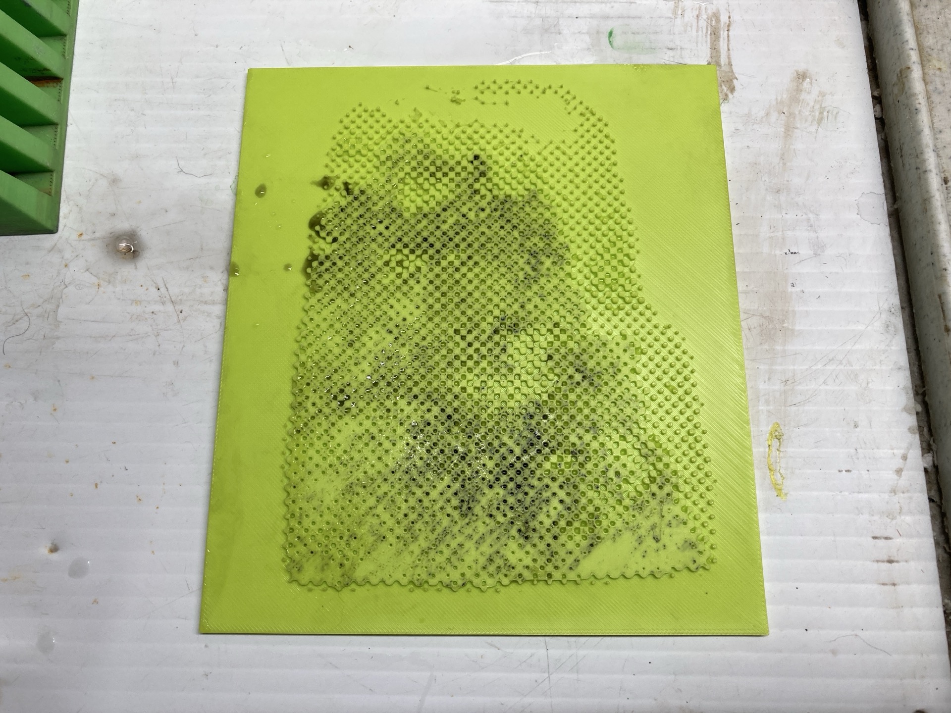
Here’s the plate, after printing it and cleaning it. I lost a few dots on the top where they were a little too small. Again, I’ll try to fix those issues next time.
This post was shared on Mastodon.