Categories
Uncategorized

Design Inspiration

Design Inspiration

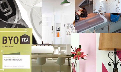
I need to collect some good links for an upcoming project… Anything with interior design, industrial design, signage, package design, graphic design, or just plain design

Workplaces, spaces, collaboration stations, desks, conference rooms, displays, doors and windows, walls, art, digital, physical, and on and on…

I’ve got a list of sites that highlight interesting design, but if you have more, please let me know!

OK, that’s my list… any suggestions?

Categories
Uncategorized

Art vs. Design

(consider it cc:by)

This drawing was inspired by the old phrase “Pioneers get the arrows, settlers get the land” which is mainly used to describe early adopters, who are the first ones to try something new, thus paving the way for others to follow, but ultimately getting “hurt” along the way. (Either by paying too much, or failing at something, or whatever.)

When I was younger I used to see this conflict between art and design. I believed that art was something you created for yourself, while design was something you created for someone else.

Over the years I’ve probably given up a bit on that belief, and I certainly know that there are blurry bits in-between and things cross over into both domains… Still, it’s something I’ve never really gotten a handle on as far as being able to fully articulate it.

I’ve never really discussed this idea with others, but would love to hear what others think about art, design and how they relate (or don’t relate) to each other…

Categories
Uncategorized

BarCampMilwaukee5 T-Shirt Design

BarCampMilwaukee5 T-Shirt Design

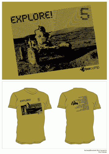
Submitted for your approval… My design concept for the BarCampMilwaukee5 t-shirt. The title is “EXPLORE!” and it’s got an astronaut driving a land rover on the Earth’s Moon.

This is just my design, and technically, you still have until Monday, September 13, 2010 to submit one. After that, It’s all up to whil. (And his team of t-shirt art-choosers.)

Categories
Uncategorized

Mac OS X 10.5.7 and Fonts

Had a bit of fun today…. one of our users ran the Mac OS X 10.5.7 update, and all was well, except that which was not, and “that which was not” was the fonts.

Do you work with graphic designers? Then you know they love fonts… lots of them!

So after rebooting, running fsck, running repair permissions, trying to verify the disk, trashing preference files, and on and on… I finally ended up disabling all fonts, and then enabling just the core system fonts, and things started working again. By things, I mean Adobe Photoshop CS3. Sure, Mail.app was having some issues getting up and running, but in Photoshop, every time a file with text was opened, it got a “program error” which also happened if you opened a new document in Photoshop and clicked the type tool.

So the culprit is a font. Probably a bad font. We still don’t know which one… but as they are re-enabled, hopefully we’ll find out… and then work on replacing it.

Categories
Uncategorized

Design like you mean it…

Hey, did you see that new logo for the Wisconsin Tourism Department? Did you make a snarky comment, or just come straight out say say “it sucks!”? Probably…

Wisconsin

But, like most things… I’m sure there is more to the story.

I often speak about the difference between art and design. Yes, there is a difference. An artist creates work to satisfy themselves, while the designer creates work to satisfy the client. You could say the artist is their own client, which is why artists die poor. Designers, on the other hand, try to create work that is great, work they can be proud of, work that solves problems… but ultimately, the client makes the decisions.

So, when you hear that some company got $50,000 for a lame logo that totally sucks, you are outraged, and you make fun of it, and call it a “rip off” and say that your third grader could do better. While these things may be true, there are always other things to consider.

I can almost guarantee the State of Wisconsin did not just write a check to some company for $50,000 and a week later got this amazing logo in an email. You’ve dealt with government, right? The project probably took 3 years, and involved dozens of people, none of which agreed on anything. I’m sure there were better ideas that were scrapped, and there may be a whole campaign involving radio, tv, and print that is part of the $50,000. (Which would actually be a pretty tiny campaign.)There may have even been multiple people tagged as the “decision maker” throughout the process, which may have changed every month, or week, or maybe even the classic “design by committee” where a group of 20 people all had to agree on one thing, and ultimately, this was the outcome. (Hint: there’s a reason Steve Jobs makes all the decisions at Apple.)

Oh, not to mention, there are usually specific requirements a company has to meet to work with government organizations, including things like who owns the company, what involvement the company has with other organizations… you know, bureaucracy stuff. It’s what government is known for!

The designers I know, the ones who still have a passion for design, and haven’t just given up yet, love to be proud of their work, and want what they feel is best for the client… but at the end of the day, the client is the customer, and the customer is always right… right? (OK, the customer is not always right, but with the economic situation today, most companies are not in a position to fire their clients.)

If you’ve worked in the design industry, you’ve probably created work for a client that you didn’t like, or actually hated, but the client loved it, so you delivered it. It’s not going in your portfolio, and you don’t admit you designed it, but that’s just the way it goes sometimes…

And if you’re wondering… yes, I too think this logo stinks, but I blame the client.

(Disclaimer: I’ve worked in the design industry for many years, and am currently working with Z2 Marketing. I have a BFA in Graphic Design, but my titles have never included the word “designer” in them.)