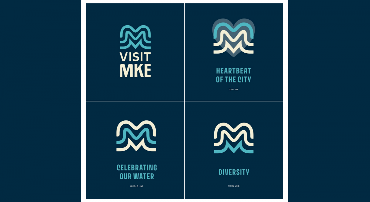
Visit Milwaukee has rebranded, and introduced a new logo. You can check their site for more info, or see the comments from the people on Facebook.
Disclaimer: I have a degree in Graphic Design, and though I’ve never held a job with the title Graphic Designer, I’ve done a lot of design, and seen a lot of good (and bad) design over the years. I’ve also worked with some very talented designers over the years. (And I’ve written about logos before.)
With that out of the way, I will say… good logo design is hard. Like, really hard. Extremely difficult. Rebrands are also challenging because there will always be people who don’t like change, or just prefer the old thing they are familiar with.
So what are my thoughts on this new logo? It’s fine. I don’t love it, but that’s okay. I think it’s recognizable and memorable, and when I see it in the future I’m recall what it is, what it’s for, and than it’s part of Visit Milwaukee.
Would I purchase merchandise with this logo on it? Probably not, but it depends very much on the application of it, and the context. I’m definitely not a huge fan of this logo. I do really like The People’s Flag of Milwaukee and I still like Milwaukee Home (though I feel they cheapened the brand when it expanded to other cities).
Overall I think the new design direction of Visit Milwaukee is good, and I look forward to seeing how it progresses over time. There’s even a chance this logo will grow on me and I’ll come to like it more than I do right now. We’ll see!


