Categories
Uncategorized

I Love The Eisner

The Eisner American Museum of Advertising & Design is holding it’s “I Love The Eisner” event on February 20th, 2009 and it will be featuring the “250 Square Feet of Art” exhibit.

The description says: “250 Square Feet of Art” gathers the work of local artists who each received a square foot of plywood with which they could create a work of art.

I submitted a piece this year, it’s titled “Crayons” and it looks like this:

Crayons

I believe they auction them off to help raise funds for the Eisner, though I’m still not sure if there are more than 250, and only 250 get selected, or if they all get auctioned off, or what… Yes, I’m short on the details.

Anyway, if you happen to be there, keep an eye out for my piece, and let me know if you see it there… Thanks!

Categories
Uncategorized

Patterns

I’d like to get more familiar with Adobe Illustrator, which is an application I’ve used on and off for the past 15 years or so, but mainly as a utility, and not so much as an illustration tool. (Bézier curves are cool.)

I’d like to draw simple shapes to start with, so I did, and then I ended up making them into patterns, as you can see below.

swirl-001
swirl-001

claw-001
claw-001

Pretty exciting, huh? I guess my motivation for making these may be caused by the fact that I’ve used other people patterns (with permission) in the past. Which brings up an interesting point… How do you license something like this? I guess a Creative Commons license makes sense. Attribution I suppose? So how would you attribute it to me? Well, if you use one of these, just say “Thanks!” really loudly in public, and assume that I heard you. (And if someone else hears you say it, that’s ok too…)


Categories
Uncategorized

For the Love of Fonts

I come from the design world. I don’t often admit this, but I love type. I love type design. I’m a fan of fonts. It’s all true…

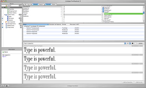
FontExplorer X

I just started playing with Linotype’s FontExplorer X. It’s an amazing application. Besides managing the fonts you have installed, it also acts as a front-end to the Linotype store. Imagine iTunes for fonts. You can browse, search, test, and purchase fonts all through FontExplorer X. Damn that’s cool!

It may only appeal to design geeks, but if you have hundreds of fonts and need to quickly go through them all to find what works for a specific design, this may be just what you need. (I know I said “hundreds of fonts” even though some designers have thousands of fonts, I just didn’t want to scare non-designers too much.)


Categories
Uncategorized

Milwaukee Design Firms, Bad Web Sites…

I spent some time evaluating the web sites of some Milwaukee design firms, and I’ve gotta say, I was sadly disappointed. I do not want to name names, because I’m going to discuss actual trends rather than specific issues. (Plus, I know people at many of these companies, and to be fair, I should disclose that I do work for at least two design firms in the area.)

Also, if you have not read my posts on Business Web Site tips, you may want to see them now: #253, #267, #271, #285, #301. Many of them apply…

The overall trends I saw were the following:

  • Inability to print pages/content
  • Inability to resize or select text
  • Inability to open multiple windows/tabs due to navigation using Flash
  • Music playing on page load (with no way to stop it)
  • Text as an image, or within Flash, which does not get indexed by search engines

Overall, many of the problems of poor usability were caused by Flash. (I know, I have a history of being somewhat anti-Flash, but so often Flash is anti-usability, so it all works out.) Many of the sites I evaluated had just one or two results in Google, which is probably not ideal for companies that want potential clients to find them.

To be fair, I know many design firms end up not overhauling their sites for a long time because they are too busy doing client work, but honestly, most of them looked like graphic or visual designers with no background in usability designed them.

Milwaukee design firms, it may be time for a reboot…


Categories
Uncategorized

The New Admirals Logo

I’ve been hearing people’s opinions on the new Milwaukee Admirals logo since it came out. My opinion, it looks like it’s meant to appeal to kids, and in doing so, does not appeal to adults. So I thought I should fix that.

Milwaukee Admiral's Logo

Here is the original version.

Milwaukee Admiral's Logo (fixed!)

Here is my version.

Ok, five minutes in Photoshop might not cut it, but you get the idea. It’s all in the eyes. In the first version the eyes just make it all look too cartoony. Skulls aren’t all happy and shiny, they are mean and scary. Or at least they should be.

(I wonder if I can find work doing logo re-design…)